What to wear for Family photos : the 2026 colour coordination guide
Planning a family photoshoot in VANCOUVER usually starts with excitement—and ends with a pile of clothes on the floor and a bit of "wardrobe worry." As a local family photographer, the #1 question I get asked is: "What should we wear?" Choosing the right outfits isn't just about looking good in the moment; it’s about creating timeless family portraits that look like art on your walls for years to come. In this two-part series, I’m breaking down the professional styling secrets that turn a "nice" photo into a gallery-worthy masterpiece.
Today, in Part 1, we are tackling the foundation: color coordination.
We’re diving into how to build a sophisticated color palette using the "Rule of Three" and why starting with Mom’s outfit is the secret to a stress-free morning. Let’s get your family camera-ready!
What to wear for Vancouver Family photos: How to co-ordinate without matching
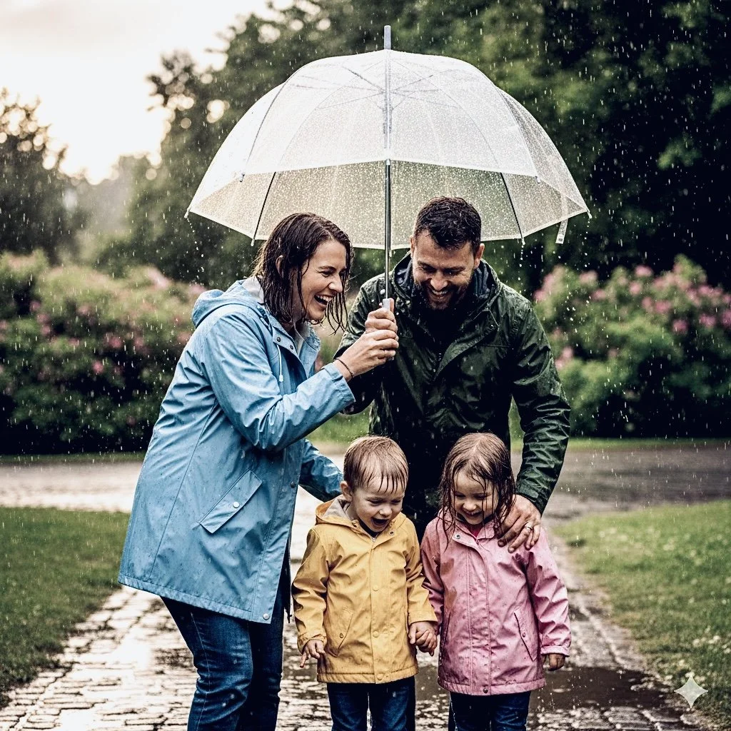
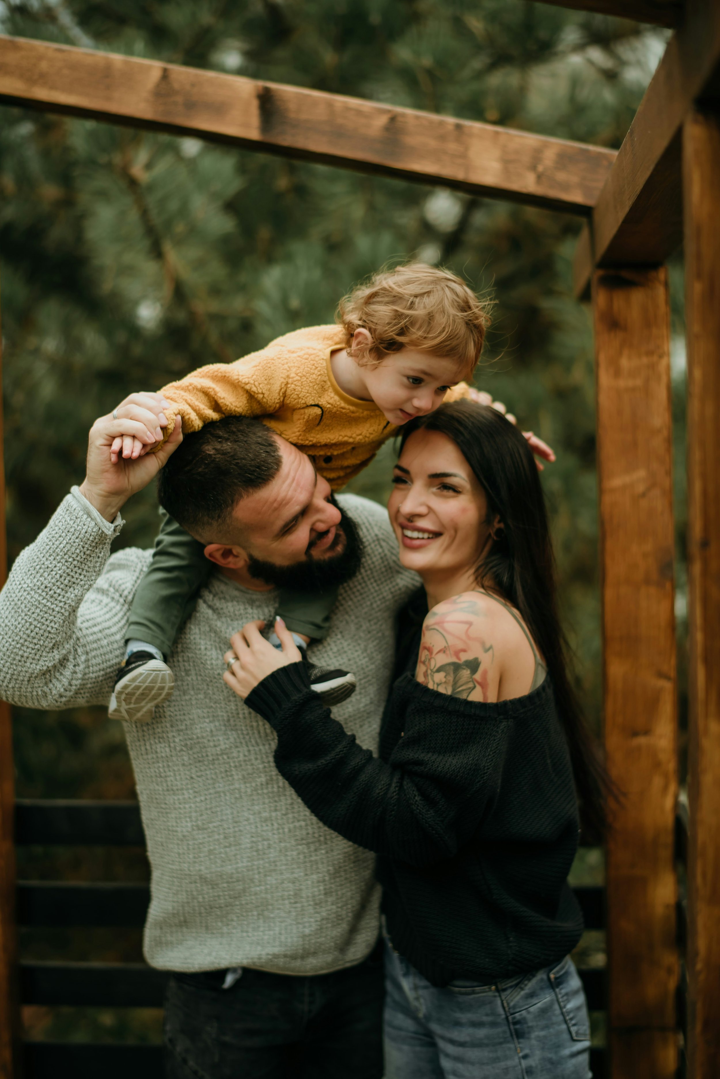
"Coordination is about tonality, not twins. If everyone wears the exact same shade of blue, you lose the depth and individuality that makes a family portrait feel real."
1.Lead outfit
Most people try to dress everyone at once and get overwhelmed. The secret is to find one piece of clothing with a pattern or a distinct color. Usually, this is Mom’s dress or a child’s floral romper, this is THE ANCHOR PIECE. It is much easier to find a pair of tan chinos to match a floral dress than it is to find a dress that perfectly matches a specific pair of pants.
2. The "Rule of Three"
Pick two neutrals (cream, grey, tan) and one accent color (dusty rose, sage green, mustard).
3. The 60-30-10 Distribution
To make the colors look balanced in the final gallery, use this interior design trick:
60% Neutral: Most of the family should be in your base neutral (e.g., creams, tans, or greys).
30% Secondary Neutral: A few people in your second shade.
10% Accent: Use your "pop" color sparingly—perhaps just on a child’s cardigan, a hair bow, or a pattern in a dress. This prevents the color from "taking over" the photo.

4. Test the "Layout"
Tell your readers to lay all the clothes out on their bed.
The Test: If you squint your eyes and one outfit "jumps out" more than the others, it’s too loud. You want your eyes to travel across the family smoothly, eventually landing on their faces, not their shirts.
"Now that you’ve mastered the 'Rule of Three' and have your family’s color palette locked in, you’re 50% of the way to a stunning gallery. But here is a professional secret: Even the perfect colors can fall flat if you choose the wrong fabrics.Have you ever wondered why some photos look like a high-end magazine spread while others just look like 'nice snapshots'? It usually comes down to three things: texture, movement, and avoiding the 'digital vibrate' effect.
In Part 2, I’m pulling back the curtain on my 'Style Pro' checklist, including:
The one fabric that adds instant luxury to any photo.
Which common clothing pattern causes a 'dizzying' distortion on camera (and how to avoid it).
The 'Shoe Rule' that can make or break your family’s silhouette.
Part 2 drops next week! To make sure you don't miss the reveal, or follow me on @dorisfamilyphotography for a first look at the 'No-Go' list."